Logos are important as they serve as visual representations and identifiers of a company, brand, or organization. They help establish a company’s brand identity and can play a crucial role in shaping consumer perception. Logos create a sense of familiarity, trust, and credibility, and help people easily recognize a brand among many others. Additionally, logos can convey a message or meaning related to the company, such as its values, mission, or product offerings.
Often logos have hidden meanings and messages, adding cleverness to their design. However, these hidden meanings should not be given too much emphasis as they often go unnoticed. The main message should be easily noticeable even at a brief glance. Although logos are well remembered, people often have an imperfect recollection of them, remembering the logo in a broad sense and not every detail. Hidden messages should be considered more like an amuse-bouche, not the main course. They should be a nice surprise, but not the defining moment of the whole experience.
Here are some well-known and less well-known examples of logos with hidden meanings and clever visuals.
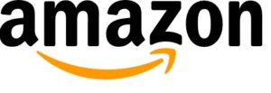
Amazon
Amazon’s logo contains an arrow under the word Amazon. The arrow starts from A and ends on letter Z. This contains a message that Amazon is a place where you can get a wide variety of different products, products from A to Z.
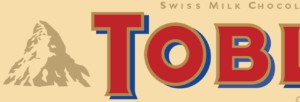
Toblerone
The most striking part of the Toblerone logo is Matterhorn. Hidden on the side of the mountain is an image of a bear. Toblerone is based in Bern, Switzerland. The city’s coat of arms contains a bear. Toblerone’s logo pays homage to their home city.
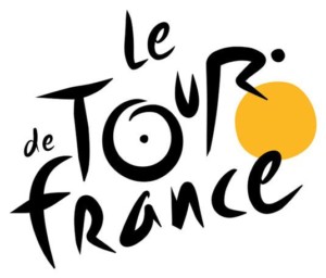
Le Tour de France
At first glance, Le Tour de France logo contains a highly stylised text “Le Tour de France”. However, a closer inspection shows that the letters “OUR” in the word “tour” also make up a bicycle and a cyclist.
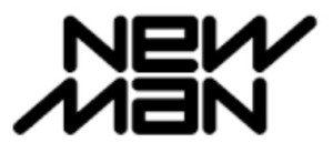
Newman
French clothing company’s logo contains a stylised word NEWMAN. The trick is that it is identical if you turn it upside down. This is handy with products that can be turned upside down. Think for example the cover of a laptop. The manufacturer must decide which way the logo is displayed. If the logo is displayed to the user when the cover is closed when the cover is open the logo will be upside down to those that are on the other side of the computer. Apple struggled with this question, and Steve Jobs decided in favour of the user. That’s why the logo was upside down to the onlookers. Eventually, this decision was reversed and now the logo is displayed correctly to the onlookers on the backside of the screen.
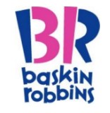
Baskin Robbins
Baskin Robbin’s logo contains the initials BR. Parts of letters B and R are highlighted so that the number 31 emerges. That was the number of flavours Baskin Robbins originally offered 31 flavours of ice cream.
FedEx
The FedEx logo contains a hidden arrow. The arrow symbolises speed and direction, both important in delivery services. Funnily enough, the arrow happened by accident. The design firm that made the logo, had developed over 400 versions of the logo when they realised that combining a capital E with lowercase x formed an arrow
Not everybody is as lucky as FedEx
The FedEx logo was a happy accident. Sometimes it also happens that the accident is less fortunate. The logo may contain elements or make inferences that were maybe not originally intended. Here are two examples.
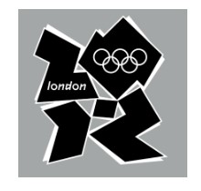
London 2012 Olympic logo
The London 2012 logo gives a somewhat questionable impression. According to the International Olympic Committee’s website, the logo symbolises the gathering of Olympic Games spectators or the meeting of athletes in the stadium at the Opening Ceremony.”
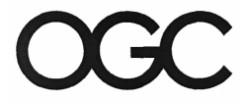
OGC
The term refers to the Office of Government Commerce. The purpose of this government office is to help the UK Government in the procurement of goods and services from the private sector. It probably would’ve been a good idea to procure the services of a trademark attorney for this trademark registration. With a bit of luck, that attorney might have rotated the logo 90 degrees clockwise. It has since been changed. All this with taxpayers’ money.
Conclusion
In conclusion, logos serve as important representations of a company, brand, or organization. They establish a brand identity, convey a message and meaning related to the company, and create a sense of familiarity, trust, and credibility. While some logos contain hidden meanings and clever visuals, these should not be the main focus. A logo should be easily noticeable and memorable, with hidden meanings serving more as a surprise. Also, when you make a logo, check for accidental hidden meanings.

